The Sideconvo Button Customizer plugin adds a powerful Sideconvo Button block to your WordPress Gutenberg editor. Once the plugin is activated and your Site ID is configured, you can insert this button anywhere on your site — no code required — and customise every detail of its appearance and behaviour directly from the block settings panel.
This guide covers every available option, from basic colours to the animated rotating text feature that makes your button stand out.
Before You Begin
Make sure the Sideconvo Button Customizer plugin is installed and your Site ID has been saved under WordPress Admin → Sideconvo Settings. Without a valid Site ID, the Sideconvo widget will not load when visitors click your button.
Step 1 — Add the Block to Your Page
- Open any page or post in the WordPress block editor.
- Click the + button to add a new block.
- Search for Sideconvo Button and click it to insert it.
- A live preview of the button renders immediately in the editor.
- Click directly on the button text in the preview and type your label — for example: Ask Our Expert AI.
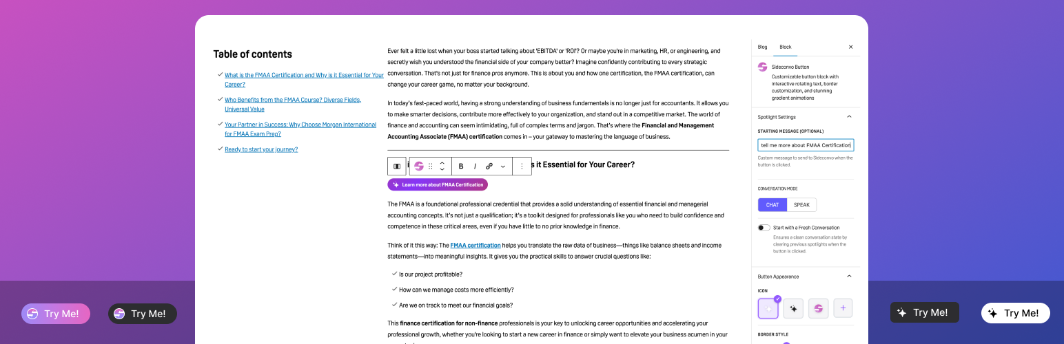
With the block selected, the right-hand Block panel shows five settings sections: Spotlight Settings, Button Appearance, Style, Spacing, and Interactive Mode. Each is covered below.
Section 1: Spotlight Settings
This section controls what happens inside the Sideconvo chat widget the moment a visitor clicks your button.
Starting Message (Optional)
Enter a message here and it will be sent automatically to the Sideconvo AI the instant the widget opens — before the visitor types anything. This is ideal for directing visitors to a specific topic.
Examples:
- “I’d like to know about your pricing plans.”
- “I need help with my recent order.”
- “Tell me about your Excel courses.”
Leave this empty if you want visitors to start the conversation in their own words.
Conversation Mode
Choose how the Sideconvo widget greets your visitor:
- CHAT — text-based conversation (default).
- SPEAK — voice-based interaction. Best for hands-free or accessibility-focused experiences.
Start with a Fresh Conversation
Toggle this on to clear any previous chat history each time the button is clicked. This ensures every session starts cleanly — recommended on high-traffic pages or when using a specific Starting Message that should always open fresh.
Section 2: Button Appearance
This section controls the visual structure of the button — its icon, border, shape, text size, and overall height.
Icon
The icon appears to the left of your button label. Choose from four options:
- Sparkle (white) — a glowing star/sparkle icon on a light button. This is the default.
- Sparkle (dark) — the same sparkle in a dark variant, better suited to light-coloured buttons.
- Sideconvo Logo — the branded purple Sideconvo “S” icon.
- Custom (+) — click to upload your own image from the WordPress Media Library. You can upload multiple custom logos and they will rotate alongside your text prompts in Interactive Mode.
Border Style
Adds a decorative border around the button:
- None — no border (default). Clean and minimal.
- Solid — a single-colour border. A colour picker appears so you can set the exact border colour.
- Gradient — a two-tone gradient border that follows the button’s rounded edges. Two colour pickers appear for Gradient Border Color 1 and Gradient Border Color 2. This creates a striking “glowing outline” effect.
Border Radius
A slider from 0 to 50 px controls how rounded the button corners are. The current value updates in real time below the slider.
- 0 px — sharp rectangle, very formal.
- 20 px (default) — softly rounded, modern feel.
- 50 px — full pill shape, friendly and approachable.
Font Size
A slider sets the button label text size in pixels. The default is 13 px. Increase this if your button is large or you want the text to be more prominent. The preview updates live.
Size (Button Height)
Three height presets:
- Compact — 22 px. Small and discreet, ideal for sidebars or footers.
- Regular — 32 px (default). Balanced for most content areas.
- Custom — reveals a height slider so you can set any value precisely (e.g. 43 px for a bold hero CTA).
Section 3: Style
This section controls the button’s background, colours, and dark mode behaviour.
Button Style
- Animated (default) — the button background cycles through a smooth gradient animation between two colours. Two colour pickers appear: Gradient Color 1 and Gradient Color 2. Defaults to rose-red (#b3425a) and violet (#7c3aed).
- Solid — a flat, single background colour. A background colour picker replaces the gradient controls. Use this for a more understated look that matches your brand palette.
Text Color
A colour picker for the button label text. Defaults to white (#ffffff). If you choose a light background colour for a Solid button, switch the text to dark for readability.
Dark Mode Customization
Toggle this on to define a completely separate button appearance for visitors who are browsing in dark mode. When enabled, three additional controls appear:
- Dark Mode Background — choose Solid (single colour picker) or Gradient (two colour pickers). The dark mode default is a near-black solid (#181a20).
- Dark Mode Text Color — set a text colour appropriate for dark backgrounds.
- Dark Mode Logo — pick a different icon variant so your logo looks correct on dark backgrounds (e.g. white sparkle on a dark button).
The plugin automatically detects dark mode via the dark-mode class on the <html> element, so no manual switching is needed.
Section 4: Spacing
Controls the margin (space) around the button relative to surrounding content.
Margin Presets
Click a preset to apply uniform spacing instantly:
- None — zero margin on all sides.
- Small — tight spacing.
- Medium — balanced spacing (good default for most layouts).
- Large — generous breathing room.
- Custom — opens the full margin editor below.
Custom Margin
When Custom is selected, four pixel inputs appear for Top, Right, Bottom, and Left. The link icon in the top-right corner of the panel links all four values — change one and all four update together. Click the link icon again to unlink and set each side independently. Use Reset All Margins to return everything to zero.
Section 5: Interactive Mode
This is the most distinctive feature of the Sideconvo Button. When enabled, the button animates on page load — expanding to show a text prompt typed out character by character, then cycling through up to five different prompts in sequence. It captures attention far more effectively than a static button.
Enable Interactive Mode
Toggle this on to activate the rotating text feature and reveal the options below.
Collapse at End
- On (default) — after all text prompts have cycled through, the button collapses back to icon-only. It then expands again on the next cycle.
- Off — the last prompt stays visible indefinitely. Use this if you want the final message to persist as a permanent label.
Resize Button When Typing
- Off (default) — the button width is fixed at the width needed for the longest text prompt. This prevents layout shift and is recommended for most pages.
- On — the button dynamically grows and shrinks as each character types in. More dramatic visually, but may cause surrounding content to reflow.
Rotating Text Prompts
This is where you write the questions or prompts the button will cycle through. You can add up to 5 prompts.
- Each prompt types in at 50 ms per character, stays visible for 2 seconds, then transitions to the next.
- Prompt 1 is always present and cannot be deleted — but it can be left empty.
- Prompts 2–5 can be deleted using the red trash icon next to each one.
- Click + Add Text Prompt to add more (up to 5 total).
Example prompt set for a finance/AI assistant:
- Try me
- Ask any question
- What can I help with?
- Ask about our courses
- Talk to our AI now
Pro tip: Keep each prompt short — under 40 characters — so the typing animation feels snappy rather than slow. Use action-oriented language to drive clicks.
Quick Reference: Settings at a Glance
| Setting | Where to find it | Default value |
|---|---|---|
| Button label text | Click directly on the button preview | (empty) |
| Starting message for AI | Spotlight Settings | (empty) |
| Conversation mode (Chat/Speak) | Spotlight Settings | CHAT |
| Fresh conversation on click | Spotlight Settings | Off |
| Icon / logo | Button Appearance | Sparkle (white) |
| Border style | Button Appearance | None |
| Border radius | Button Appearance | 20 px |
| Font size | Button Appearance | 13 px |
| Button height | Button Appearance | Regular (32 px) |
| Background style (animated/solid) | Style | Animated gradient |
| Gradient colours | Style | #b3425a → #7c3aed |
| Text colour | Style | White (#ffffff) |
| Dark mode customisation | Style → Theme Customizable | Off |
| Margin | Spacing | None (0 px all sides) |
| Interactive mode / rotating text | Interactive Mode | Off |
| Collapse after prompts cycle | Interactive Mode | On |
| Dynamic button width while typing | Interactive Mode | Off (static width) |
| Number of text prompts | Interactive Mode | 1 (max 5) |
Recommended Combinations
Hero Section CTA — Maximum Impact
- Style: Animated with bold gradient colours
- Border: Gradient border matching the button colours
- Size: Custom, 48–56 px tall
- Border Radius: 50 px (full pill)
- Interactive Mode: On with 3–5 engaging prompts
- Collapse at End: On
Sidebar or Footer Button — Subtle and Tidy
- Style: Solid with your brand colour
- Border: None
- Size: Compact (22 px) or Regular (32 px)
- Border Radius: 8–12 px
- Interactive Mode: Off
Topic-Specific Landing Page Button
- Starting Message: pre-fill with the page’s topic
- Conversation Mode: CHAT
- Fresh Conversation: On
- Interactive Mode: On with prompts matching the page topic
Dark-Themed Site
- Dark Mode Customization: On
- Dark Mode Background: dark solid or dark gradient
- Dark Mode Logo: Sparkle (white) for visibility
- Dark Mode Text Color: white
What Happens When a Visitor Clicks the Button
- The Sideconvo chat widget opens on the page.
- If Start with a Fresh Conversation is on, any previous session is cleared first.
- The widget opens in the selected Conversation Mode (Chat or Speak).
- If a Starting Message is configured, it is sent to the AI automatically — the visitor sees the AI responding immediately, without having to type anything first.
Frequently Asked Questions
Can I add more than one Sideconvo Button to a page?
Yes. You can insert the block multiple times on the same page. Each instance can have completely different settings — for example, one button for “Ask about pricing” and another for “Get technical support”, each with its own Starting Message.
Can I use it outside Gutenberg — in Elementor, for example?
Yes. The plugin also includes a dedicated Elementor widget with the same customisation options, available in the Elementor editor panel.
The button shows but the chat widget doesn’t open when clicked. What’s wrong?
This almost always means the Site ID has not been configured, or the Sideconvo service URL is not reachable. Go to WordPress Admin → Sideconvo Settings, confirm your Site ID is saved, and check your environment’s base URL is using HTTPS.
Does the rotating text animation respect reduced-motion preferences?
Yes. The plugin includes prefers-reduced-motion CSS support, so visitors who have enabled reduced-motion in their operating system settings will see a simplified, non-animated version of the button.
How do I remove the button from a page?
Click the block in the editor to select it, then press Backspace or open the three-dot block menu and choose Remove block. The button disappears from the published page immediately after saving.